

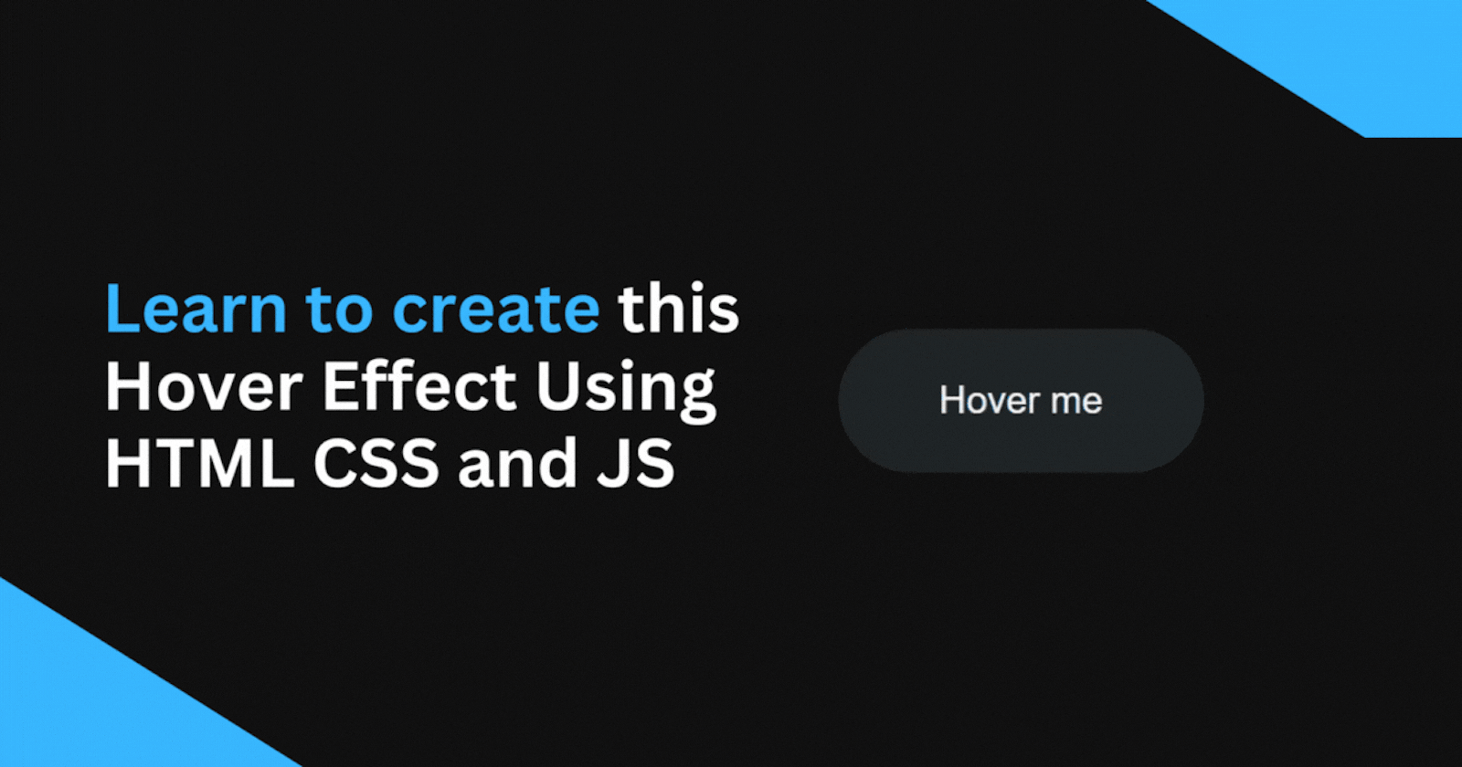
Cool Button Hover Effect: A Step By Step Tutorial using HTML, CSS and JavaScript
Learn how to make a hover effect that fills a button with color from bottom to top on hover, and fills out from bottom to top on hover out


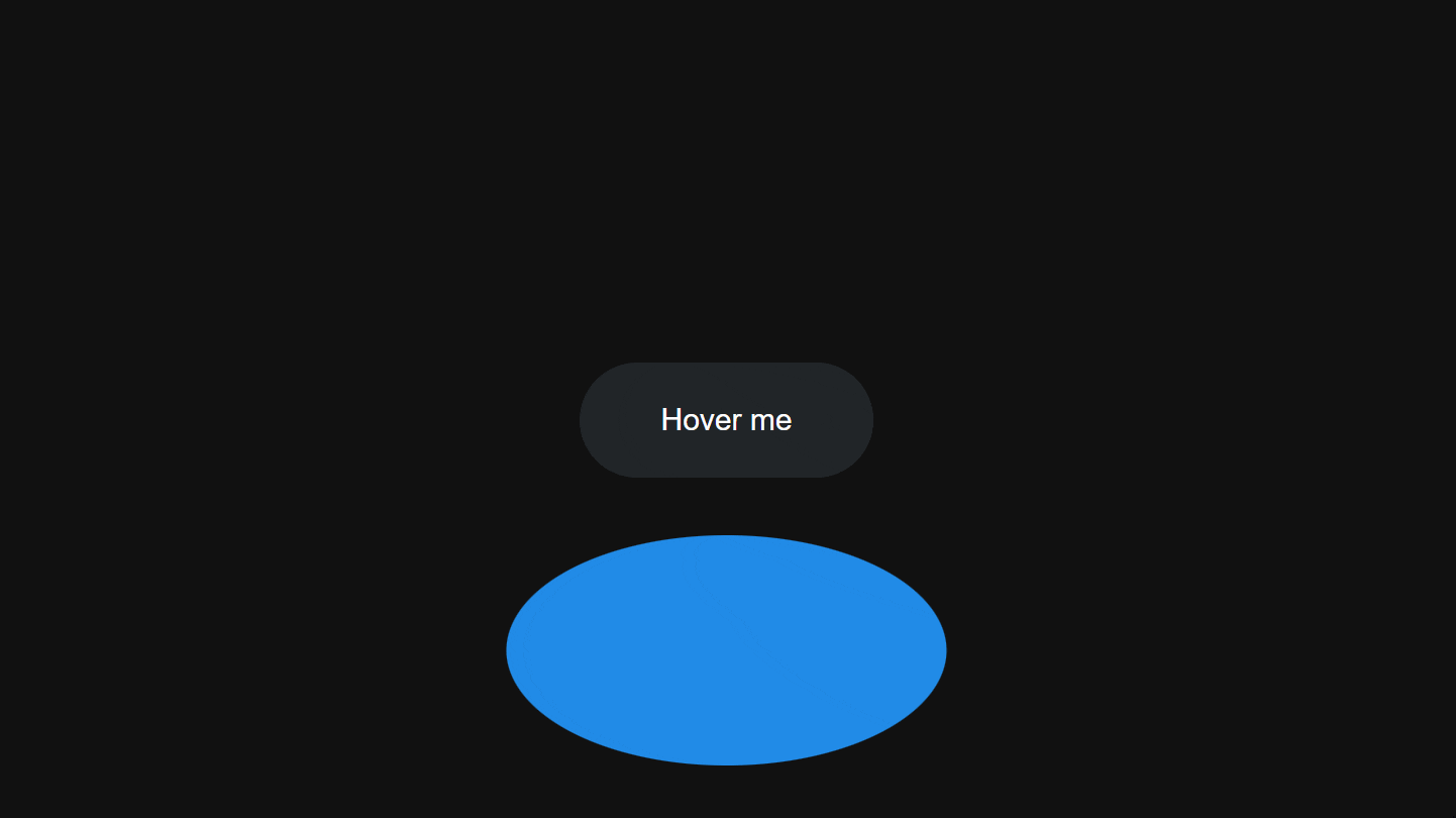
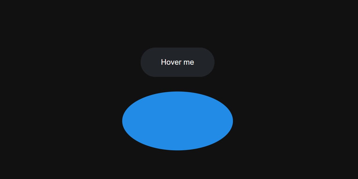
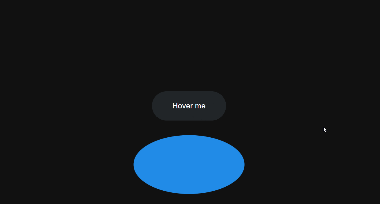
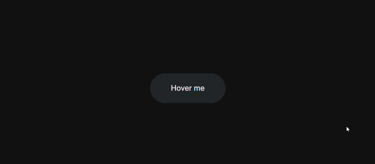
Behind The Scenes Preview
To help you understand how this hover effect really works, here's what it looks like behind the scenes:
Starting HTML Structure
<button class="btn">
  Hover me
</button>
CSS Styles
body{
  background: #111;
}

.btn {
  background-color: #212529;
  color: white;
  cursor:pointer;
  font-size: 1.5rem;
  padding: 2rem 4rem;
  border: none;
  border-radius: 100vmax;
  position: relative;
  transition: scale 0.4s ease;
}
Creating the Button Fill Element
Now we'll create a new element inside the button that we will use to fill the button when we hover over it:
<button class="btn">
  <div class="btn-fill"></div>
  Hover me
</button>
.btn-fill {
  background: #228be6;
  width: 150%;
  height: 200%;
  border-radius: 60%;
  position: absolute;
  top: 50%;
  left: 50%;
  transform: translate(-50%, 50%);
}
Since the default behavior of the CSS :hover selector causes the element to go back to its normal position when we hover out, and we want the fill element to move upwards instead of returning downwards when hovered out, we will need to use JavaScript to handle the transitions.
Animating the Button Fill
First, let's create a reusable function for animating the button fill element.
function animateBtnFill(btnFill, translateY, duration) {
  requestAnimationFrame(() => {
    btnFill.animate(
      {
        transform: `translate(-50%, ${translateY}%)`,
      },
      { duration, fill: 'forwards', easing: 'ease' }
    )
  })
}
By placing the animate method inside the requestAnimationFrame, the animation is synchronized with the browser's rendering, leading to a smoother and more visually appealing animation.
We used animate method to set the position of the btn-fill and set the fill option to forwards so the btn-fill won't go back to its original position when the animation is done.
Setting up mouse enter/leave event:
const buttons = document.querySelectorAll('.btn');

buttons.forEach((btn) => {
  const btnFill = btn.querySelector('.btn-fill')

  btn.addEventListener('mouseenter', () => {
    // Mouse Enter Event
  });

  btn.addEventListener('mouseleave', () => {
    // Mouse Leave Event
  });
});
In the code snippet above we used querySelectorAll to select all the buttons in the DOM and loop through all the buttons where we attach event listeners for mouse enter/leave, we did this so that we can use this hover effect in multiple buttons.
Let's animate the btn-fill on mouseenter:
btn.addEventListener('mouseenter', () => {
  animateBtnFill(btnFill, 50, 0);

  animateBtnFill(btnFill, -50, 850);
});
In the code snippet above we used animateBtnFill(btnFill, 50, 0) to set the Y position of the btn-fill to 50% and 0 duration on mouseenter so it just flicks back to the bottom when we hover the button therefore it will always come from the bottom when we hover the button.
After that, the second animation happens animateBtnFill(btnFill, -50, 850), it sets the btn-fill Y to -50% which puts it in the center of the button which makes it look like the button is being filled with its color.
Now let's animate the btn-fill to go above the bottom on mouseleave :
btn.addEventListener('mouseleave', () => {
  animateBtnFill(btnFill, -150, 850)
})
Setting Button Overflow to Hidden
.btn {
 overflow: hidden;
}
Fixing z-index Issue
Great, now we just need to fix the issue of the btn-fill covering the content of our button:
<button class="btn">
  <div class="btn-fill"></div>
  <div class="btn-content">Hover me</div>
</button>
.btn-content {
  position:relative;
  z-index: 2;
}
We have created a div called btn-content that will contain the contents of our button. We have also set its position to relative so that the z-index applies to the btn-content and places it on top of the btn-fill.
Changing the Button Scale on Hover
Finally let's just change the scale of the button when we hover over it:
.btn:hover {
  scale: 1.05;
}
External Links:
Codepen Link: link
Learn more about requestAnimationFrame and animate
That's it you just learned how to achieve this cool hover effect, I hope you found this one helpful and If you have any questions or comments please feel free to leave them in the comments section.