

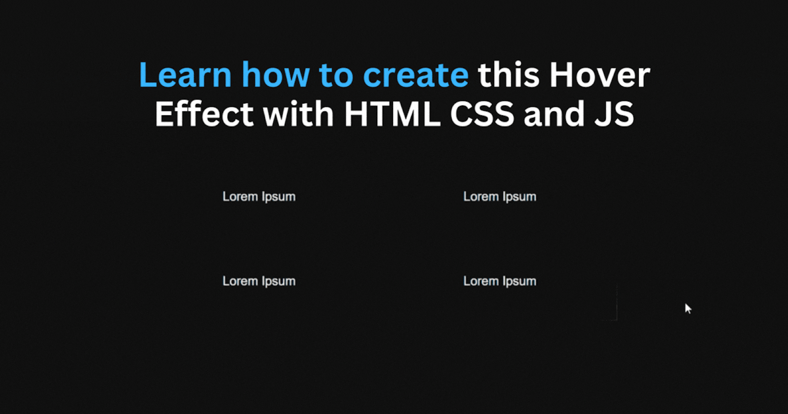
Windows 10 Setting Hover Effect: A Step By Step Tutorial
Learn how to create this windows 10 settings hover effect that you can use in your website with HTML, CSS and JavaScript


HTML Structure
<div>
  <div class="container">
    <div class="box">
      <div class="box-content">Lorem Ipsum</div>
    </div>
        <div class="box">
      <div class="box-content">Lorem Ipsum</div>
    </div>
    <div class="box">
      <div class="box-content">Lorem Ipsum</div>
    </div>
     <div class="box">
      <div class="box-content">Lorem Ipsum</div>
    </div>
  </div>
</div>
CSS Styles
body {
  background-color: #111;
}

.container {
  gap: 8px;
  display: grid;
  width: fit-content;
  grid-template-columns: repeat(2, 1fr);
}

.box {
  color: white;
  position: relative;
  width: 300px;
  height: 100px;
}
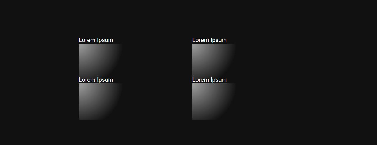
Creating the Border Glow Effect
Next, we will create a gradient on our boxes using the ::after pseudo-element by using the radial-gradient function to create a circle gradient inside of all the boxes.
.box::after {
  content: "";
  height: 100%;
  width: 100%;
  transition: opacity 500ms;
  background: radial-gradient(
    600px circle at 0 0,
    rgba(255, 255, 255, 0.6),
    transparent 20%
  );
  position: absolute;
}
Let's make it follow the mouse using JavaScript:
document.body.onmousemove = e => {
  for(const date of document.getElementsByClassName("box")) {
    const rect = date.getBoundingClientRect(),
          x = e.clientX - rect.left,
          y = e.clientY - rect.top;

    date.style.setProperty("--mouse-x", `${x}px`);
    date.style.setProperty("--mouse-y", `${y}px`);
  };
}
The code above loops through all the boxes whenever the mouse moves and takes the position of the mouse. It then sets two CSS custom variables (--mouse-x and --mouse-y), which we can use to position the gradient inside the boxes.
We can now use the (--mouse-x and --mouse-y) custom variables in our CSS to position the gradient based on the mouse position:
.box::after  {
  background: radial-gradient(
    600px circle at var(--mouse-x) var(--mouse-y),
    rgba(255, 255, 255, 0.6),
    transparent 20%
  );
}

Covering the Gradient up
Now the gradient glow effect is working but you can see the whole gradient when moving the cursor and we only need it to be visible a few pixels on all sides to create the border like effect.
We can fix this by using the box-content div to cover it up:
.box::after {
 z-index: 1;
}

.box-content {
  background-color: #111;
  position: absolute;
  z-index: 2;
  display: flex;
  align-items: center;
  justify-content: center;

  inset: 1px;
}
We set the background-color of the box content to match the background color of the page and set the z-index higher than the ::after pseudo element which puts it below the box-content div.
Also, we set the inset property to 1px which sets the size of the box-content div to be 100% - 1px on all sides. This makes the gradient visible only 1px on all sides.
Note: The inset property is now used to set the border size of the box.
Creating The Glow Effect on Hover
.box:hover::before {
  content: "";
  position: absolute;
  height: 100%;
  width: 100%;
  transition: opacity 500ms;
  background: radial-gradient(
    500px circle at var(--mouse-x) var(--mouse-y),
    rgba(255, 255, 255, 0.08),
    transparent 30%
  );
  z-index:3;
}
Here we just created another radial gradient using the ::before pseudo element that also follows the mouse but with the z-index set to 3 so its on top of the box content div:
That's it! You have just learned how to achieve this hover effect.
I hope you found this helpful. If you have any feedback or questions, please feel free to leave them in the comments section.
External Links:
- Codepen
- Radial Gradient
- Before and After Pseudo Elements